Org-babel-gnuplot
Org-babel support for Gnuplot
Introduction
org-babel-gnuplot allows gnuplot code to be executed directly from within embedded code blocks in Org-mode documents. These code blocks can plot functions, graph data from tables stored in the documents, and can include output as embedded graphics when the document is exported.
The following provides instructions and some examples of gnuplot usage. Since babel is simply allowing native code to run inside of Org-mode, all gnuplot documentation is applicable and valid. 1
This file may be downloaded here: org-babel-gnuplot.org. The image links are to the images online on Worg, but running the code blocks will produce matching images in the same directory as the .org file.
Requirements and Setup
Babel support for gnuplot requires that gnuplot be installed on your
system, along with gnuplot.el, an Emacs major mode for interacting
with gnuplot. You can install gnuplot.el with ELPA.
It should be mentioned that one can also use Org-mode's org-plot as an
alternative to babel. Instructions already exist on Worg for
this.2 The .org file used to create the org-plot Worg entry is
linked in the Introduction on that page and can be very helpful in
getting a feel for using gnuplot by using the #+PLOT header above a
table. This page, in contrast, is about using gnuplot in it's "native"
form.
To do this, babel support for the gnuplot language must be enabled. Versions of Org-mode prior to 7.01 required enabling both general babel support as well as specific language support like this:
;; set up babel support
(require 'org-babel)
(require 'org-babel-init)
(require 'org-babel-gnuplot)
;; add additional languages with (require 'org-babel-language)
As of Org-mode 7.01, babel support is included and there is no need to load it via .emacs. All you have to do is enable specific language support with the following in .emacs:3
;; active Babel languages
(org-babel-do-load-languages
 'org-babel-load-languages
 '((gnuplot . t)))
;; add additional languages with '((language . t)))
From then on, to access the power of gnuplot, the setup is generally like this:
Data Table (if pulling from a table and not a formula)
#+tblname: data-table
| x | y1 | y2 |
|---+----+----|
| 0 |  3 |  6 |
| 1 |  4 |  7 |
| 2 |  5 |  8 |
Gnuplot Source Block
#+begin_src gnuplot :var data=data-table :file output.png

  gnuplot code goes here

#+end_src
To run gnuplot and produce a resultant graph (or to produce any result
from babel code blocks), simply move one's cursor anywhere in the code
block and press C-c C-c (Ctrl+C followed by Ctrl+C) and type "yes"
in the minibuffer when asked about executing the code. It's that
simple!
Caveat: Windows
Unfortunately, there seems to be an issue with getting gnuplot-mode working properly with Org-mode on Windows machines. Attempts to use Babel for gnuplot code blocks or the org-plot method both seem to fail. Discussion is taking place on how to resolve this issue.4 As of Aug/Sept 2010, Bruce Ravel, the creator of gnuplot-mode, has indicated willingness to work with a mailing list member to identify the potential source of the issue.
Babel Header Arguments
Babel block headers are used to pass various arguments to control the results of the executed code. The complete list of header arguments is covered in the Org-mode manual; for now, some options frequently used for gnuplot are:5
:var data=data-table- When data is to be plotted from a table, it is helpful to use a
heading right above the table in the form
#+tblname=data-table, where "data-table" is replaced with some short name to identify the table to gnuplot.
- When data is to be plotted from a table, it is helpful to use a
heading right above the table in the form
:exports {code, results, both, none}- When the code is run and the document exported (e.g. to HTML or \LaTeX PDF), what should appear? Just the code block itself? Only the produced output (in this case a plot of some sort)? Both the code and the accompanying results? Or nothing?
:file foo.{png,eps,etc.}- This option specifies where the resulting output should be put. If
no option is given, a gnuplot window will open with the
resultant plot. NOTE: Certain plot options may not output
properly to gnuplot directly and thus must have the
:file
    filename
option in the header. If the error "Code block produced no output" recurs, try outputting to a file instead of directly to gnuplot.
- This option specifies where the resulting output should be put. If
no option is given, a gnuplot window will open with the
resultant plot. NOTE: Certain plot options may not output
properly to gnuplot directly and thus must have the
Note that the current `gnuplot-mode' doesn't provide support for
multiple sessions, so it is not possible to run concurrent gnuplot
sessions (see reset in Code Blocks).
Quick Gnuplot Overview
As stated earlier, the full gnuplot documentation can and should be
consulted as the official reference, but it might be helpful to lay
out some common syntax here as a quick reference. Any of the commands
typed in code font below should be assumed to reside in a babel
code block (between #+begin_src gnuplot and #+end_src).
Title and Axis Labels
Set the title for the whole graph like this:
set title "This Title Goes at the Top"
Set axis labels like so:
set xlabel "This is the X Axis"
set ylabel "This is the Y Axis"
Graph Width/Height Raio
The size ratio of the graph is controlled like so:
- Wider/shorter:
set size ratio 0.5(any number less than 1) - Taller/thinner:
set size ratio 2(any number greater than 1) - Square (1:1):
set size square
Tic Marks
Tic marks are set with the method "start,increment[,end]." Start is the beginning tic value, increment sets how far apart the tics are, the the optional end specifies a stopping value. If no end is given, the tics will carrry on by the increment value until the max x/y value is reached. Here are some examples:
set xtics 0,10,100  %% tics every 10 from 0 -> 100
set ytics -10,50    %% tics every 50 from -10 onward
Named tics can also be used. Two values are provided, a numerical value (where on the given axis the tic should be placed) and a name in quotes to indicate what word should be placed at the tic instead of the numerical value. This method allows for words instead of numbers to be used (which has many uses) as well as for complete control over tic mark placement.
set xtics ("Tic 1" -1, "Tic 2" 10, "Tic 3" 1001)
The gnuplot default is for tics to show up on both sides and the top and bottom of the graph. In other words, the tics on the left y-axis and bottom x-axis are "mirrored" to the opposing side of the plot borders. Stop this (tics only on left/bottom) by using:
set xtics nomirror
set ytics nomirror
You can rotate tic marks for increased readability by specifying an angle at which to rotate their labels. Here is the syntax (substitute any angle value for -45):
set xtics rotate by -45
set ytics rotate by -45
Plot
The heart of gnuplot is the plot command. It is broken down into
several sections:
Plot what?
This will either be a function or data. Plotting a function would look like this:
f(x) = x**2
plot f(x)
Plotting data would go like this (remembering that the variable "data" was defined to correspond to some table in the Org-mode document):
plot data using x:y
The x:y identifies the column numbers in the table that should
be used for the x values and corresponding y values. Using the command
plot data using 1:3 would tell gnuplot to go down the rows of the
table and plot points using x values from the first column and grab
corresponding y values from the third. "Using" can be abbreviated with
as simply "u" which helps keep lines shorter (plot data u 1:3).
Plot how?
To customize the look of plots, many options are available. To pass these options to gnuplot looks like this:
plot data u 1:2 with lines
In this case gnuplot will use the linestyle lines to plot the
data. This will create a colored line through the data points. Some
commonly used options (and their abbreviations) are:
- points (p)
- dots (d)
- lines (l)
- linespoints (lp)
- impulses (i)
- steps
- boxes
One can find all available plot styles in the documentation or
elsewhere online.6 To thicken up lines or points, just add lw #
(stands for "lineweight) after the style (e.g. ...with lines lw
3). The default weight is 1 which can look a little light. Use 2 or
more for thicker, easier to see, lines and points. The word "with" can
be abbreviated "w" to shorten code lines; plot data u 1:3 w l lw 2
is equivalent to plot data using 1:3 with lines lineweight 2.
Call it what?
Add a title in the graph key like this:
plot data u 1:2 w lines lw 2 title 'Data Set 1'
To omit one (or more) plots from the key, use the notitle option:
plot data u 1:2 w lines notitle, \
     data u 1:3 w points title 'Data Set 2', \
     data u 1:4 w lp title 'Data Set 3', \
     data u 1:5 w bars notitle
This is especially helpful when multiple data sets are plotted together. Sometimes, however, a key is not desired at all. When only one function or data set is plotted and its title is obvious, put this in the code block to get rid of the key altogether:
set nokey
Sometimes the key itself in its default position (upper right) is
distracting from the graph, especially when the with points plot
style is used since the point in the key looks like a point on the
graph. To set a nice border around the key, do this:
set key box linestyle -1
The linestyle -1 creates a black lined border. The gnuplot manual and other locations list all available linestyles (colors, dots, dashes, etc.).7
Any more?
If more than one plot is to be made on the same graph, it's done like this for fuctions:
f(x)=x**2
g(x)=x**3
h(x)=sqrt(x)
plot f(x),g(x),h(x)
For data from tables, it's like this:
plot data u 1:2 w lines, data u 1:3 w points, \
     data u 1:4 w lp
This plots column 1 (x) against column 2 (y) with lines, 1 against 3
with points, and 1 against 4 with linespoints. The use of the \
tells gnuplot to keep reading onward to the next line. Typically the end of a line signals the
end of the command and gnuplot will complain since data u 1:4 w lp
isn't a command all by itself without plot preceding it. The \
ensures that the whole command is understood. One can make an
extremely long line, but \ helps keep things looking tidy and keeps
one from scrolling left and right to track the whole line of code.
Basic Plot Examples
Following some introductory topics, here are some basic examples showing what things look like when all of the above is combined.
Function Plot
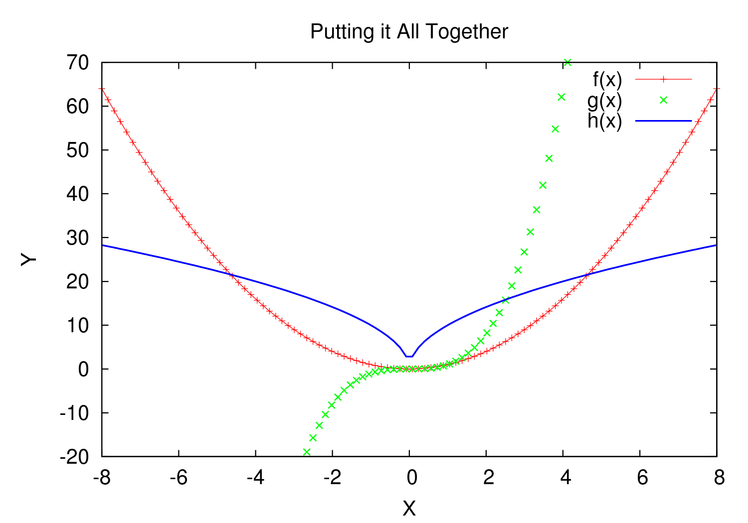
A full babel block of code for a few functions might look like this:
#+begin_src gnuplot :exports code :file file.png
reset

set title "Putting it All Together"

set xlabel "X"
set xrange [-8:8]
set xtics -8,2,8


set ylabel "Y"
set yrange [-20:70]
set ytics -20,10,70

f(x) = x**2
g(x) = x**3
h(x) = 10*sqrt(abs(x))

plot f(x) w lp lw 1, g(x) w p lw 2, h(x) w l lw 3
#+end_src
Data Table Plot
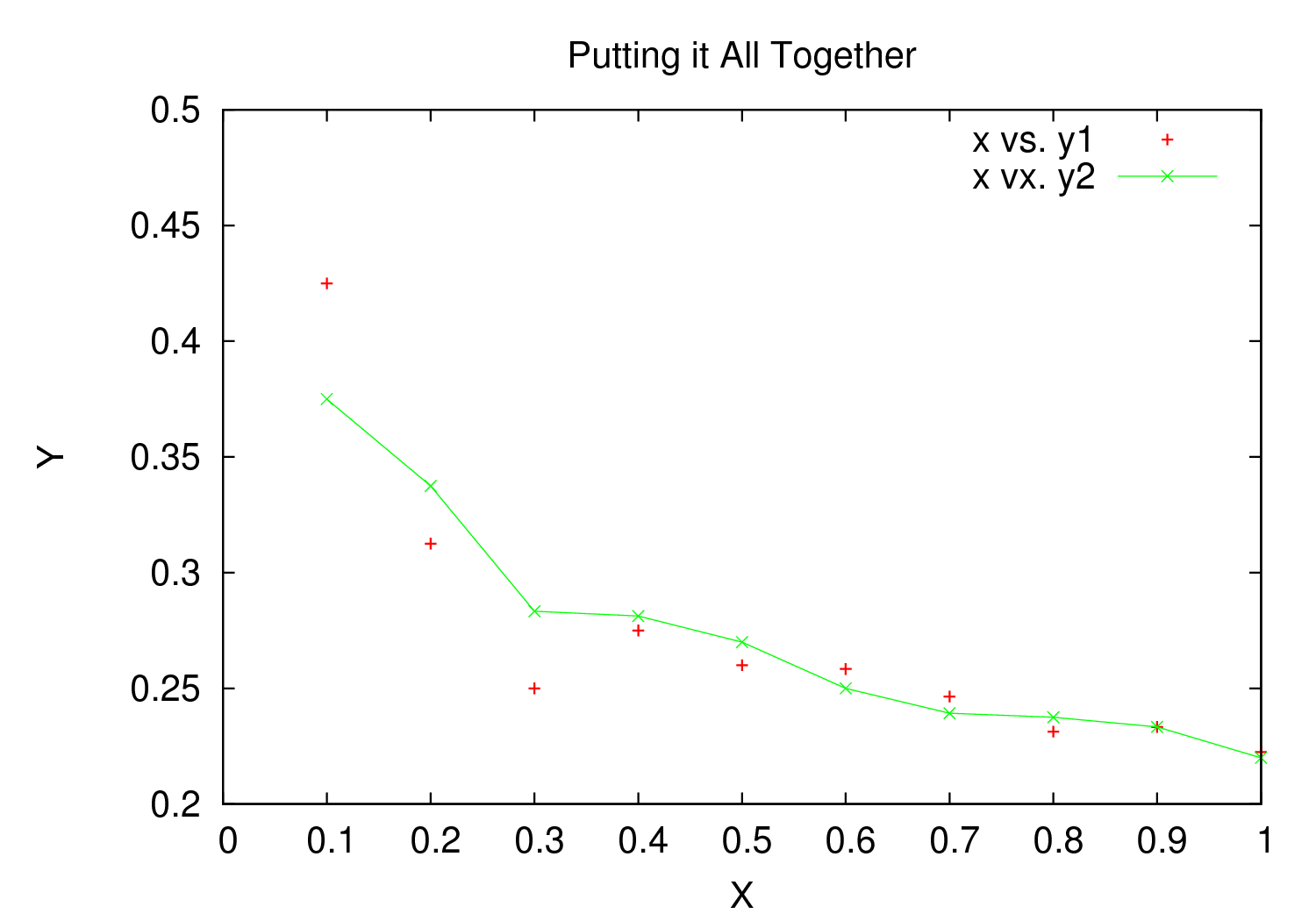
Plotting data points from a table could look like this:2
| x | y1 | y2 |
|---|---|---|
| 0.1 | 0.425 | 0.375 |
| 0.2 | 0.3125 | 0.3375 |
| 0.3 | 0.24999993 | 0.28333338 |
| 0.4 | 0.275 | 0.28125 |
| 0.5 | 0.26 | 0.27 |
| 0.6 | 0.25833338 | 0.24999993 |
| 0.7 | 0.24642845 | 0.23928553 |
| 0.8 | 0.23125 | 0.2375 |
| 0.9 | 0.23333323 | 0.2333332 |
| 1 | 0.2225 | 0.22 |
#+begin_src gnuplot :var data=basic-plot :exports code :file file.png
set title "Putting it All Together"

set xlabel "X"
set xrange [0:1]
set xtics 0,0.1,1


set ylabel "Y"
set yrange [0.2:0.5]
set ytics 0.2,0.05,0.5


plot data u 1:2 w p lw 2 title 'x vs. y1', \
     data u 1:3 w lp lw 1 title 'x vx. y2'
#+end_src
Above and Beyond
Named X-Values/Tics
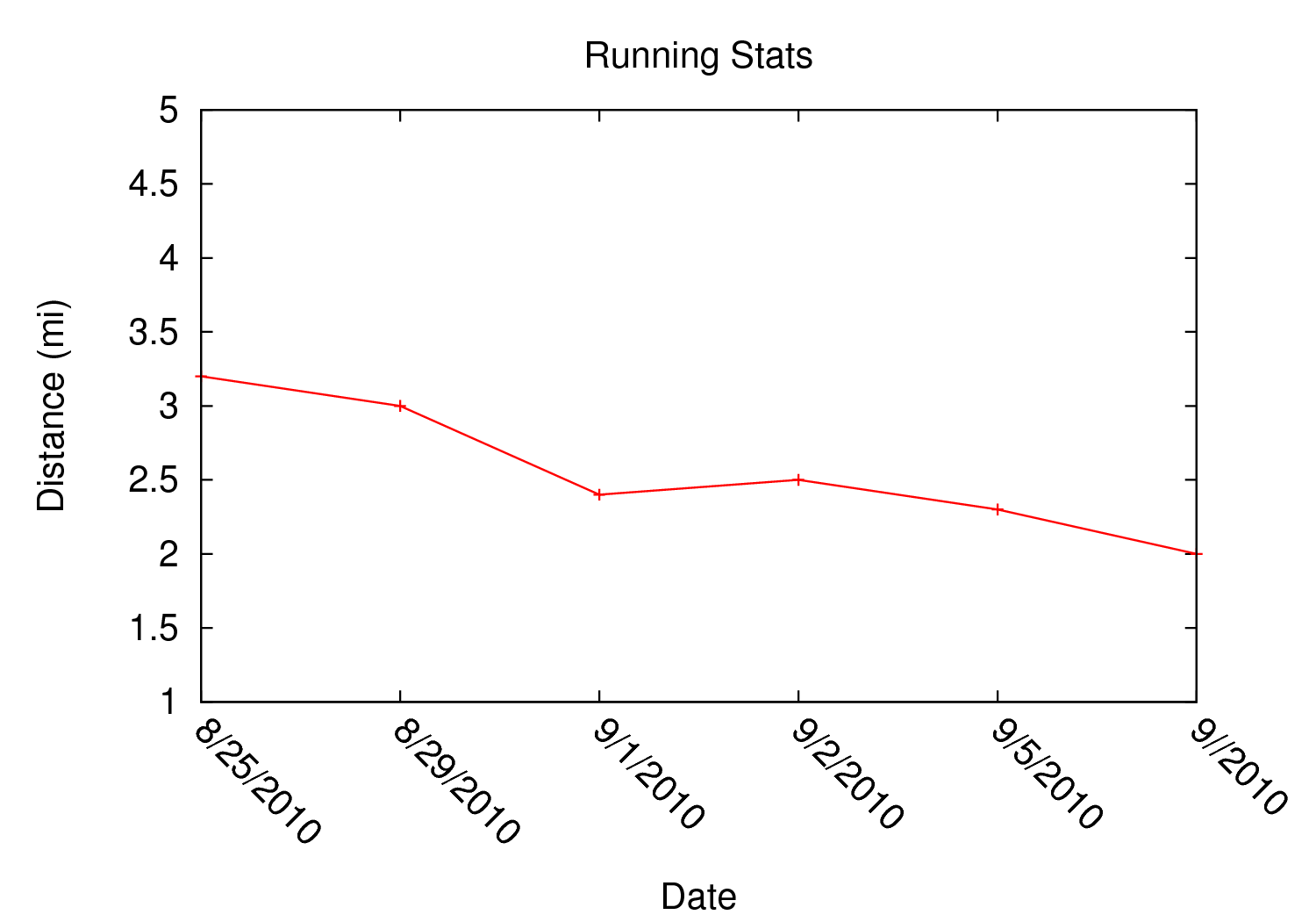
Sometimes it's desireable to have text as the x-values/xtics instead of numbers.8 Gnuplot will plot a column of text entries as the x-values for its points by spacing the named values evenly along the axis. Here's an example of a running distance log:9
| Date | Distance |
|---|---|
| 8/25/2010 | 3.2 |
| 8/29/2010 | 3.0 |
| 9/1/2010 | 2.4 |
| 9/2/2010 | 2.5 |
| 9/5/2010 | 2.3 |
| 9//2010 | 2.0 |
#+begin_src gnuplot :var data=xtics :exports code :file file.png
  reset

  set title "Running Stats"

  set xlabel "Date"
  set xtics rotate by -45

  set yrange [1:5]
  set ylabel "Distance (mi)"

  plot data u 2:xticlabels(1) w lp lw 2 notitle
#+end_src
The 2:xticlabels(1) tells gnuplot to use the values in column 1 for
the xtic names and to plot them against the y-values in column 2.
Unevenly Spaced X-Values/Tics
While the above example works extremely well when evenly placed tics is
desired, other circumstances may arise in which
unevenly spaced text values may be desired.10 Remember from above that
it is possible to set text xtics manually with set xtics ("name"
value, "name2" value2,...), but the method here has the advantage of
being automatic. Here is an example:
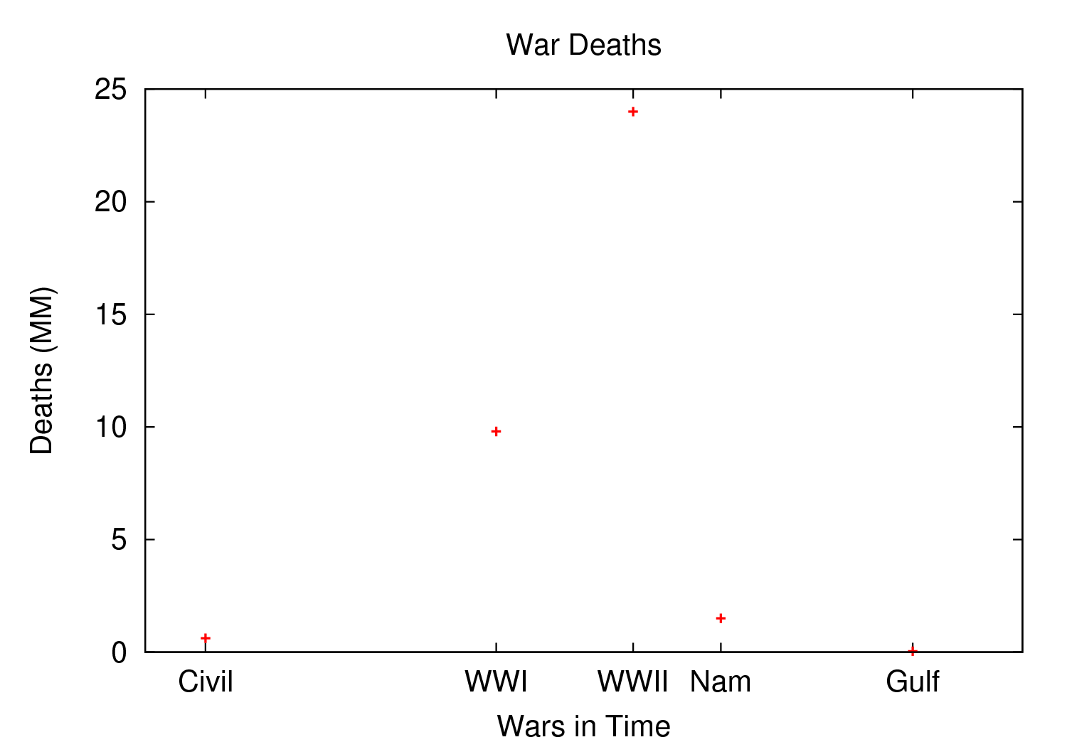
To accomplish this, make a table with a column for the value of the xtics (where it should be placed on the axis), another column with the name for each xtic (the names to be used), and then add whatever subsequent y values should correspond to these x-values. Here is an example:
| tic name | x-value | Dead (y) |
|---|---|---|
| Civil | 1861 | 0.62 |
| WWI | 1914 | 9.8 |
| WWII | 1939 | 24 |
| Nam | 1955 | 1.5 |
| Gulf | 1990 | 0.04 |
#+begin_src gnuplot :var data=named-xtics :exports code :file file.png
  reset

  set yrange [0:25]
  set ylabel "Deaths (MM)"

  set xtics ("1850" 1850, "2010" 2010)
  set xrange [1850:2010]
  set xlabel "Wars in Time"

  set title 'War Deaths'

  plot data using 2:3:xticlabels(1) w p lw 3 notitle
#+end_src
For multiple data sets, simply include multiple columns for y-values
to be plotted and plot each data set with the syntax
x:y:xticlabels(col #). Most likely, the col # will be the same for
all data sets (the column of names for xtics will probably remain the
same). Here is an example:
plot data u 2:3:xticlabels(1) title 'Set1',\
data u 2:4:xticlabels(1) title 'Set2', \
data u 2:5:xticlabels(1) title 'Set3'
#+end_src
Multiple X/Y Axes
It is possible to set different scales for both x and y axes. This can be helpful for various reasons:
- Plotting data in two units of measure (e.g. left y axis = degrees F, right = degrees C)
- Plotting one data set against one axis and another against the other in the same graph
Returning to the running log, perhaps both times and distances were to be plotted in the same graph:11
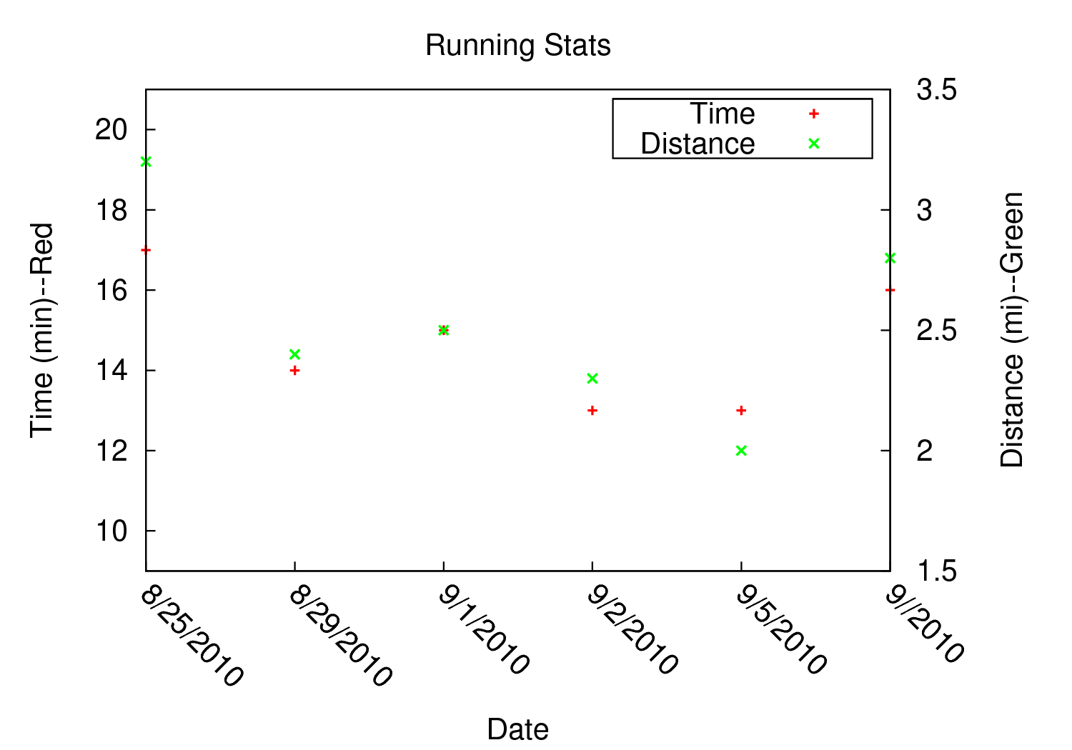
| Date | Time | Distance |
|---|---|---|
| 8/25/2010 | 17:14 | 3.2 |
| 8/29/2010 | 14:00 | 2.4 |
| 9/1/2010 | 15:13 | 2.5 |
| 9/2/2010 | 13:45 | 2.3 |
| 9/5/2010 | 13:20 | 2.0 |
| 9//2010 | 16:35 | 2.8 |
#+begin_src gnuplot :var data=multi-axes :exports code :file file.png
  reset

  set title "Running Stats"
  set size ratio square
  set key box linestyle -1

  set xlabel "Date"
  set xtics nomirror rotate by -45

  set yrange [9:21]
  set ylabel "Time (min)--Red"
  set ytics nomirror

  set y2range [1.5:3.5]
  set y2label "Distance (mi)--Green"
  set y2tics 0,0.5,3.5

  set style data points
  plot data u 2:xticlabels(1) axis x1y1 lw 3 title 'Time', \
       data u 3:xticlabels(1) axis x1y2 lw 3 title 'Distance'
#+end_src
Walking through the new items in the code:
y2range,y2label, andy2ticsset the options for the second y-axis, the one on the right side of the graph- Setting both
xticsandyticstonomirrorkeeps tics off of the top of the plot border as well as keeping the left ytics from showing up on the right y-axis since the scales are different (this would be confusing) - The plot commands have an
axis x#y#argument- The first is plotted against the bottom x-axis (
x1) and the left y-axis(y1) by insertingaxis x1y1 - The second is plotted against the bottom x-axis (the x-values are
the same for both plots) but the right y-axis with
axis x1y2
- The first is plotted against the bottom x-axis (
Lastly, in a plot like this where the left and right axis units (distance and time) can be related (d/t = speed), it is possible to create a "calibrated" plot. Note the ranges specified for the two graphs:
- y1min = 9min, y2min = 1.5mi; 1.5mi/9min = 10mph
- y1max = 21min, y2max = 3.5; 3.5mi/21min = 10mph
Since both axes are "calibrated" in this way, examining the two points plotted for each date can be visually informative:
- Distance/time on top of each other indicate that the speed was 10mph
- If the distance plot is higher than time, speed > 10mph (e.g. 9/2)
- If the time plot is higher than distance, speed < 10mph (e.g. 9/5)
Simply changing the yranges allows for re-calibrating the plot for a different target speed.
Different Scales
Sometimes, more than one scale is desired on the x-axis to
call attention one or more areas on a curve. Perhaps most of a curve
is rather "plain," but some detail exists which would stand out more
if the scale were altered. This can be accomplished by something
called multiplot which uses multiple graphs overlayed next to
one another to create the appearance of one graph that uses varying scales
along the x-axis.12 , 13 Here is an example:
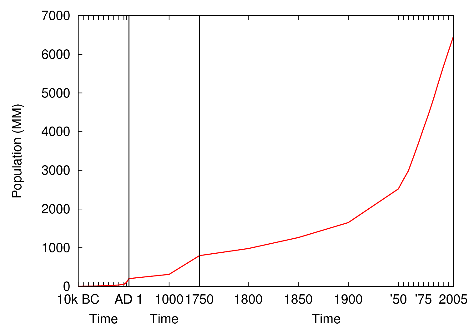
Here is some data on the population of the world through time:14
| tic name | x-loc | Pop |
|---|---|---|
| 10k BC | -10000 | 1 |
| -9000 | 3 | |
| -8000 | 5 | |
| -7000 | 7 | |
| -6000 | 10 | |
| -5000 | 15 | |
| -4000 | 20 | |
| -3000 | 25 | |
| -2000 | 35 | |
| -1000 | 50 | |
| -500 | 100 | |
| AD 1 | 1 | 200 |
| 1000 | 1000 | 310 |
| 1750 | 1750 | 791 |
| 1800 | 1800 | 978 |
| 1850 | 1850 | 1262 |
| 1900 | 1900 | 1650 |
| \'50 | 1950 | 2519 |
| 1955 | 2756 | |
| 1960 | 2982 | |
| 1965 | 3335 | |
| 1970 | 3692 | |
| \'75 | 1975 | 4068 |
| 1980 | 4435 | |
| 1985 | 4831 | |
| 1990 | 5263 | |
| 1995 | 5674 | |
| 2000 | 6070 | |
| 2005 | 2005 | 6454 |
#+begin_src gnuplot :var data=diff-scales :exports code :file file.png
  reset

  set xrange [ -10000 : 1 ]
  set yrange [ 0 : 7000 ]
  set xlabel "Time"

  set multiplot

  set size 0.275,1
  set origin 0.0,0.0
  set lmargin 10
  set rmargin 0
  set ylabel "Population (MM)"
  set ytics nomirror
  plot data using 2:3:xticlabels(1) with lines lw 3 notitle

  set origin 0.275,0.0
  set size 0.15,1
  set format y ""
  set noytics
  set lmargin 0
  set rmargin 0
  set xrange [2 : 1750]
  set ylabel ""
  plot data using 2:3:xticlabels(1) with lines lw 3 notitle

  set origin 0.425,0.0
  set size 0.575,1
  set format y ""
  set noytics
  set lmargin 0
  set rmargin 2
  set xrange [1751 : 2005]
  set ylabel ""
  plot data using 2:3:xticlabels(1) with lines lw 3 notitle

  set nomultiplot
#+end_src
Walking through the code:
- Left Slice
- An initial
xrange/yrangeare set for the left-most "slice" of the graph - An x-axis label is also provided and the multiplot mode is set
set sizetells gnuplot to make the first slice the full height high (1) but only .275 (out of 1) wide. This leaves 72.5% of the graph for the next two slicesset origintells gnuplot to start the plot at the bottom left (0,0)lmarginis set for 10 (standard) butrmarginis set at 0 in order to let the left edge of the middle slice sit against the right edge of the left-most slice with no gap- The
ylabelis set here, and only once. Each slice is treated as a separate graph, and setting it for each slice creates mutliple labels which is unnecessary since they all share the same label/units. - Lastly, the data is plotted
- An initial
- Middle slice
- New values are given for the
xrange, theylabelis set to blank, and the plot command is about the same - This time both
lmarginandrmarginare set to 0 to allow for seamless alignment with the left-most and right-most slices of the plot - The size is set for 0.15 width since this portion does not need to be very wide
- Note that the origin is set to start where the previous slice left off (left slice origin + left slice width = 0 + 0.275 = 0.275)
- New values are given for the
- Right slice
- New values are given for the
xrange, theylabelis set to blank, and the plot command is about the same again - The
lmarginis 0 so that the slice aligns with the right edge of the middle slice, butrmarginis set for 2 to provide a nice border between the picture and the right y-axis - The origin for the right slice is set for the left slice width + middle slice width = 0.275 + 0.15 = 0.425
- The size is set to take up the remaining width: 1 - 0.275 - 0.15 = 0.575
- New values are given for the
The set no ytics option removes the tics from the vertical divisions
separating the slices. Using set ytics nomirror on the first
slice keeps the ytics off of the first division.
The divisions could be turned off altogether if one wanted to. Gnuplot
accepts setting borders individually in the form of set border
1+2+4+8. Each number stands for one of the borders:
1= bottom2= left4= top8= right
For no vertical divisions in our example, this would be used:
- Left slice: use
set border 1+2+4(bottom, left, top) - Middle slice: use
set border 1+4(bottom, top) - Right slice: use
set border 1+4+8(bottom, top, right)
While slightly more visually appealing, this may be potentially confusing since no divisions gives the illusion that the x-axis is the same scale. If the divisions are there, it helps communicate that there is something else going on.
This method can be used for functions instead of data from a table as well in order to zoom in on a particular slice of a graph. One of the previous footnote above presents such case.13
Broken X-Axis
Arrows can be used quite cleverly to "break" axes.15 , 16 , 17 The method involves drawing 6 arrows to "break" both the top and bottom x-axes: 2 diagonal and 1 white per axis to create the illusion of a break.
While the following is not really to scale, the example of a far distant date with a broken line and then some recent dates shows one example where this can be employed to create an esthetically pleasing plot. The world population data will be used again with some slight modifications.
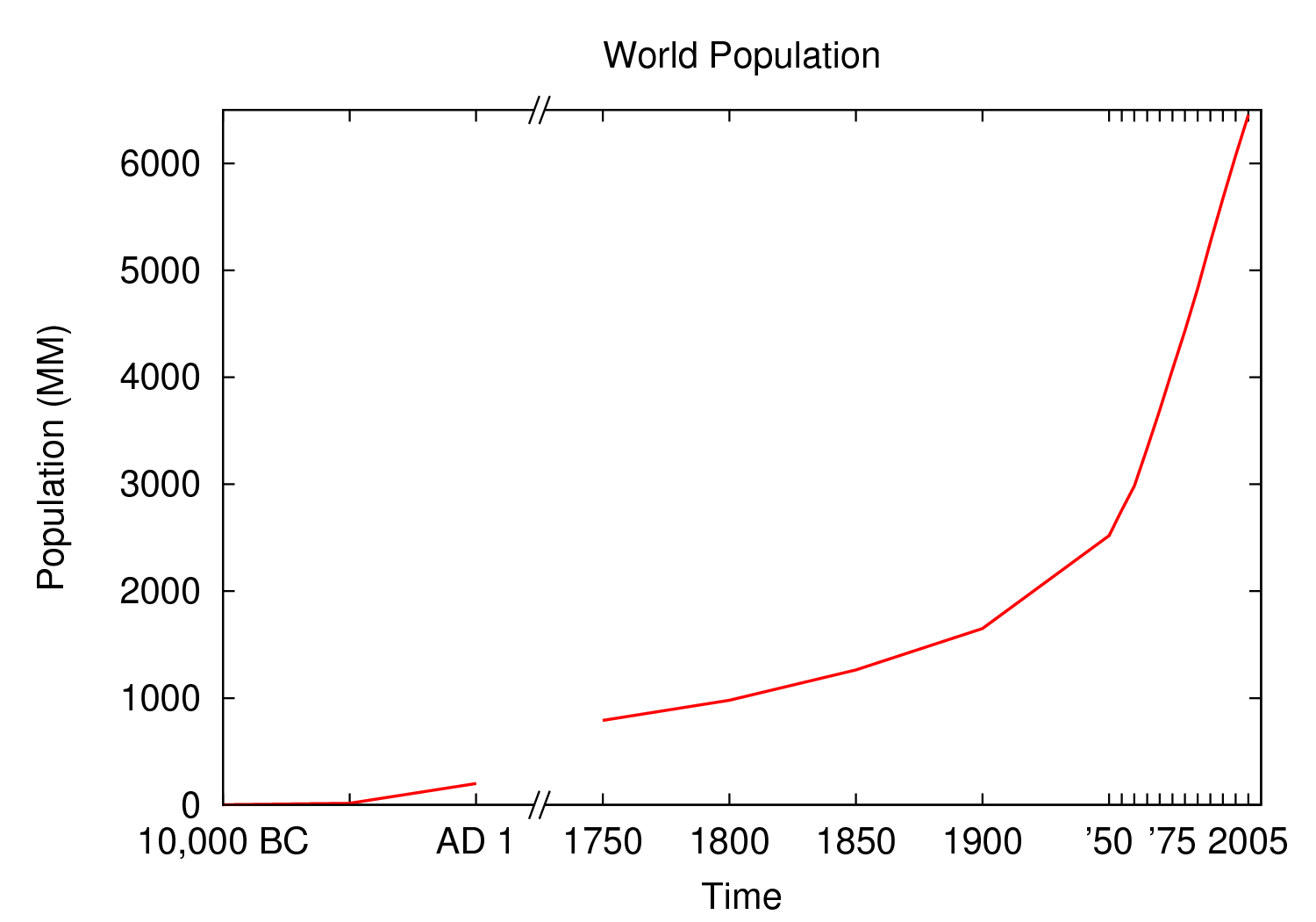
| tic name | x-loc | Pre | Post |
|---|---|---|---|
| 10,000 BC | 1600 | 1 | |
| 1650 | 15 | ||
| AD 1 | 1700 | 200 | |
| 1750 | 1750 | 791 | |
| 1800 | 1800 | 978 | |
| 1850 | 1850 | 1262 | |
| 1900 | 1900 | 1650 | |
| \'50 | 1950 | 2519 | |
| 1955 | 2756 | ||
| 1960 | 2982 | ||
| 1965 | 3335 | ||
| 1970 | 3692 | ||
| \'75 | 1975 | 4068 | |
| 1980 | 4435 | ||
| 1985 | 4831 | ||
| 1990 | 5263 | ||
| 1995 | 5674 | ||
| 2000 | 6070 | ||
| 2005 | 2005 | 6454 |
#+begin_src gnuplot :var data=broken-axis :exports code :file file.png
  reset

  A=1725
  B=1600
  C=2010
  D=0
  E=6500

  xoff=.005*(C-B)
  yoff=.02*(E-D)

  set arrow 1 from A-xoff, D to A+xoff, D nohead lw 2 lc rgb "#ffffff" front
  set arrow 2 from A-xoff, E to A+xoff, E nohead lw 2 lc rgb "#ffffff" front
  set arrow 3 from A-xoff-xoff, D-yoff to A+xoff-xoff, D+yoff nohead front
  set arrow 4 from A-xoff+xoff, D-yoff to A+xoff+xoff, D+yoff nohead front
  set arrow 5 from A-xoff-xoff, E-yoff to A+xoff-xoff, E+yoff nohead front
  set arrow 6 from A-xoff+xoff, E-yoff to A+xoff+xoff, E+yoff nohead front

  set xrange [B:C]
  set yrange [D:E]

  set xlabel 'Time'
  set ylabel 'Population (MM)'
  set title 'World Population'

  plot data u 2:3:xticlabels(1) w l lw 3 notitle, data u 2:4:xticlabels(1) w l lw 3 lc 1 notitle
#+end_src
Here are some notes on the above:
- A->E are variables used to set the break location (A), the
xrange(B,C) and theyrange(D,E) - xoff/yoff have to do with the break. xoff is the gap created in the x-axis and yoff is the height above and below the scale for the diagonal lines. The multipliers (.005 & .02) work for this example but may need tinkering to work elsewhere (if they don't look right).
- The arrows (the
set arrow...commands) draw the 4 diagonal lines and a white line in between them to create the actual break - Two sets of y values and two plot commands were used to create the break between AD 1 and 1750. This is not always needed. See the gnuplot-tricks blog for how to do this with a continuous function (e.g. sin x) and an "offset" variable for the same effect.16
In the case above, the x-axis is "cheated" in that it is not only broken, but the scale is artificially manipulated. In the data chart, there should have been population values at 10,000 BC, 5,000 BC, and 1 AD. Instead they occur at 1600, 1650 and 1700 AD. The spacing is proportionate, but scaled by 100x (50 years apart vs. 5,000). Compared to the plot from 1750-2005, it's obviously not the same x-axis scale. If the actual data points were used, the later data points would have been significantly "scrunched." While not technically correct, it's perhaps more visually appealing, especially where scale is not too important. To get the point across, it does the job very well: left of break was not much growth, then in a much smaller time scale to the right of the break, much population growth occurred. The multi-axes/scales in the previous section is more "honest" with respect to scale, but perhaps this example is cleaner/better looking.
Obviously there are many functions (like sin (x) from gnuplot-tricks) where changing the scale is not required and thus the plot is both visually appealing and manipulation of scales is not required.
Miscellaneous Tips/Tricks
Helpful odds and ends are constantly surfacing on the Org-mode mailing list. This section will serve as a reservoir for summarizing new developments and techniques as they arise.
reset in Code Blocks
Sometimes when executing code blocks, odd results occur. Plots will
persist in displaying the wrong title, a "remnant" option from a
previously generated plot will appear, the size ratio will be wrong,
etc. This typically happens when multiple gnuplot blocks exist in the
same document. The use of reset at the beginning of each gnuplot
block eliminates these issues by clearing any "residual options" from
previously generated output.
Image Quality
For many graphs, output to .png (with :file filename.png in the header) may be
sufficient. Sometimes, however, the generated image quality is not
acceptable. The mailing list provided an excellent solution
for increased gnuplot image quality:18
#+begin_src gnuplot :file file.eps
  reset
  set terminal postscript [color] [solid] eps enhanced 20
  ...
  ...
#+end_src
Note the output to file.eps, which corresponds to the set
terminal... command used. This creates a higher resolution .eps image instead of a
.png. The color and solid options are optional. Without the
color option, the output will default to monochrome (black and
white). The solid option can be used to keep all linestyles as solid
lines; without it, gnuplot will cycle through various styles of
dashes/shapes/etc.
Once the .eps file is generated, ImageMagick can be used to convert it to .png:19
convert -density 300 file.eps file.png
Footnotes:
Gnuplot manual downloads: http://www.gnuplot.info/documentation.html
Org-plot on Worg: https://orgmode.org/worg/org-tutorials/org-plot.html
7.01 list of user visible changes: https://orgmode.org/Changes.html#ob-configuration-changes
Org-mode manual on babel header args: https://orgmode.org/manual/Specific-header-arguments.html#Specific-header-arguments
Nice plot style summary: http://t16web.lanl.gov/Kawano/gnuplot/intro/style-e.html
Nice list of colors and styles: http://www2.yukawa.kyoto-u.ac.jp/~ohnishi/Lib/gnuplot.html
Pertinent mailing list discussion and convenient data source: http://www.mail-archive.com/emacs-orgmode@gnu.org/msg29840.html
